Aug 15, 2019
Creating a color palette used to be something like a dark art before I discovered a systematic way to build them. Umm, well let's just be honest, I just copy them. Systematically. Great artists steal after all! 😋
The rest of this post describes my 5-step process for having a full-fledged color palette ready to use for any situation. Let's begin.
Step 1 - Find Inspiration
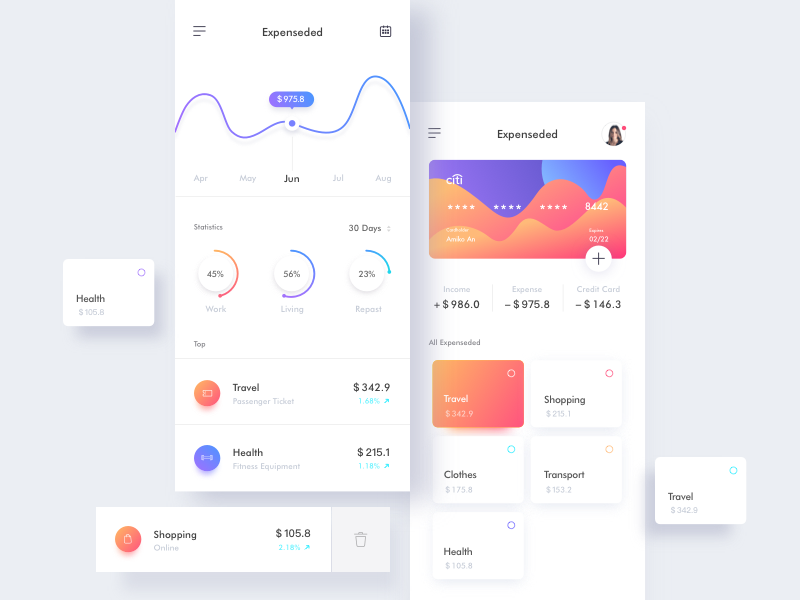
This is the easy part. There's a ton of good work on the web. My chief source is muzli's weekly newsletter. It gives me a plethora of designs and artwork to choose from straight to my inbox. Pretty much everything that makes it in the newsletter is great in some way. It would be overwhelming if the process wasn't so easy. As an example, I'll use the following dashboard from edition #162 created by Amiko for Reborn Design:

Most of the time I tend not to use app designs like this as they already have distinct color palettes. This can be good when working with a well-defined project, but it can be limiting if you are trying to find unique colors to work with. The best sources for that are often the art pieces and photographs at the bottom of the newsletter as the color boundaries for those are not so obvious.
Step 2 - Pick the main colors
Picking the colors involves just getting a color picker tool and picking the the main colors from the image. I
usually just open the image in sketch and create rectangles with the given colors. It's important to categorize the colors into a system that makes sense to you. My usual system is to designate colors primary,
secondary, accent1, accent2...accentN, light, and dark.
If I'm working on an application that will have forms and error states, I also add in colors for positive (usually a green), negative (a red), and warning (an orange or a yellow). We'll skip the application colors for this post, but it's simple enough to add them once you get the gist of the process.
On to selecting the main colors. The current image presents somewhat of a challenge because it uses gradients. What I usually do in that case is to pick the 2 colors that the gradient is made of and just find the extremes. In the case of the purple-blue gradient, those are the two colors. So I select blue as the primary and purple as the secondary.
Primary

Secondary

We could have also chosen the orange-red gradient as the source for our primary and secondary colors, but I can only justify using red when not in the context of an application. Something like a landing page or portfolio site is fine, but I avoid it in anything that can have errors as that's usually what I reserve the color red for.
With that said, we'll use the orange-red gradient as our accent1 and accent2 colors. These are useful for spicing things up.
Accent 1

Accent 2

If you noticed, there's also a light aqua blue color in there being used for the percentage increases among other things. We'll name this one accent3 and hold it in reserve in case we need more options.
Accent 3

By the way, this is why I use the accentN notation for these colors. I used to use accent and alt, but soon ran out of words to describe variations of these. You often find a whole bunch of colors that you might to want to use after the initial discovery phase. Just increasing the count is much easier than having different words to describe accent colors.
Step 3 - Create shades and tints for each color
This is the crucial step that takes your current color palette from just a collection of colors to something that is practical for real world applications. Shades and tints are what you can use for different states of a button or link (disabled, hover, focus, visited). They can help highlight table rows or simply just give you more options to distinguish different elements from each other. Not to mention, they can be crucial in creating subtle gradients which are appealing to the eye without grabbing its attention.
My process for this is really just an eye test. I wish I could state a formula for this part, but it's really just trying to get 5 distinct variations of the same hue. That said, you should try to keep the same level of shades and tints for each color. This will help a lot in unifying your palette. Don't force it though, it's an art not a science. Use your eyes.
I also have a naming convention for the shades and tints. I use lightest, lighter, darker, and darkest. I used a number scale before (1-5) but often found it clumsy as I always had to remember if 5 was the darkest or lightest value.
The first part of this process is finding a color not too far from your main that's still distinctly darker:
Primary to Primary.Darker

And then repeat the process using the darker value as your new reference point to find the darkest value for that color:
Primary.Darker to Primary.Darkest

Do the same for the lighter end of the scale (you could also have begun with this side):
Primary to Primary.Darker

Primary.Darker to Primary.Darkest

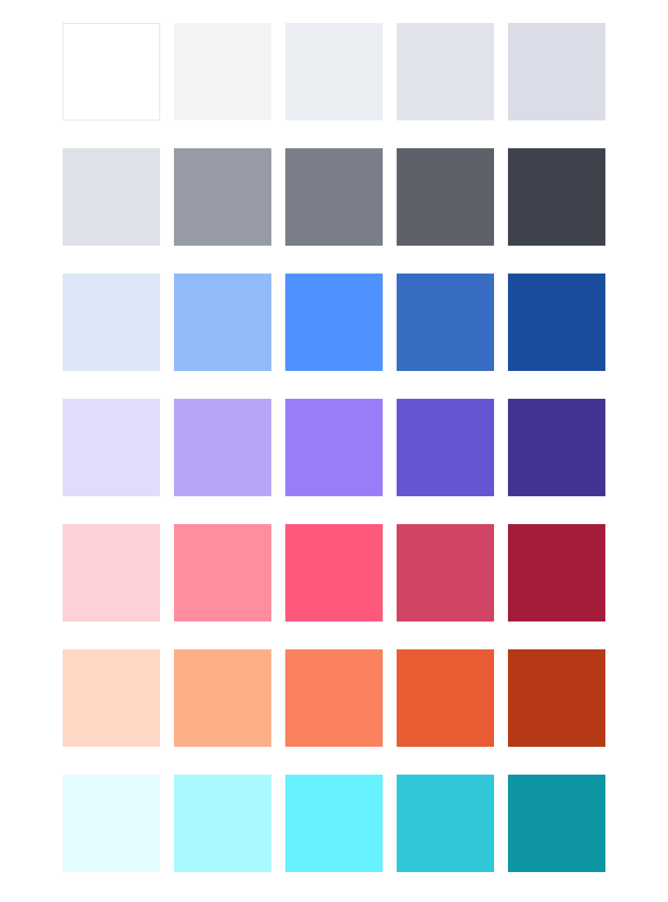
Repeat this for the rest of the colors and you'll now have a full set of shades and tints:
Primary with Shades and Tints

Secondary with Shades and Tints

Accent 1 with Shades and Tints

Accent 2 with Shades and Tints

Accent 3 with Shades and Tints

Step 4 - Find complimentary shades of light and dark greys
These are for your backgrounds and text. If you have a light theme, then light for backgrounds and dark for text; for dark themes, these would obviously be flipped. Much like for the shades and tints, try to keep your light and dark grays the same flavor as your colors. Meaning if your colors are light on saturation, keep your grays at the same level. That makes them easier to meld with the rest of the colors. You can also just use a color picker to grab these from the source if that's easier for you. Usually those already fit, but you'll still have to play around with the values to get them just right. The source is just a starting point, you still have to use your eyes.
For this palette I chose the following for light and dark:
Light

Dark

After shading and tinting using a similar process as for the main colors:
Light with Shades and Tints

Dark with Shades and Tints

Step 5 - Put Everything Together
Tadah! You now have a solid color palette that should cover all your needs.
